Visualizations Gallery
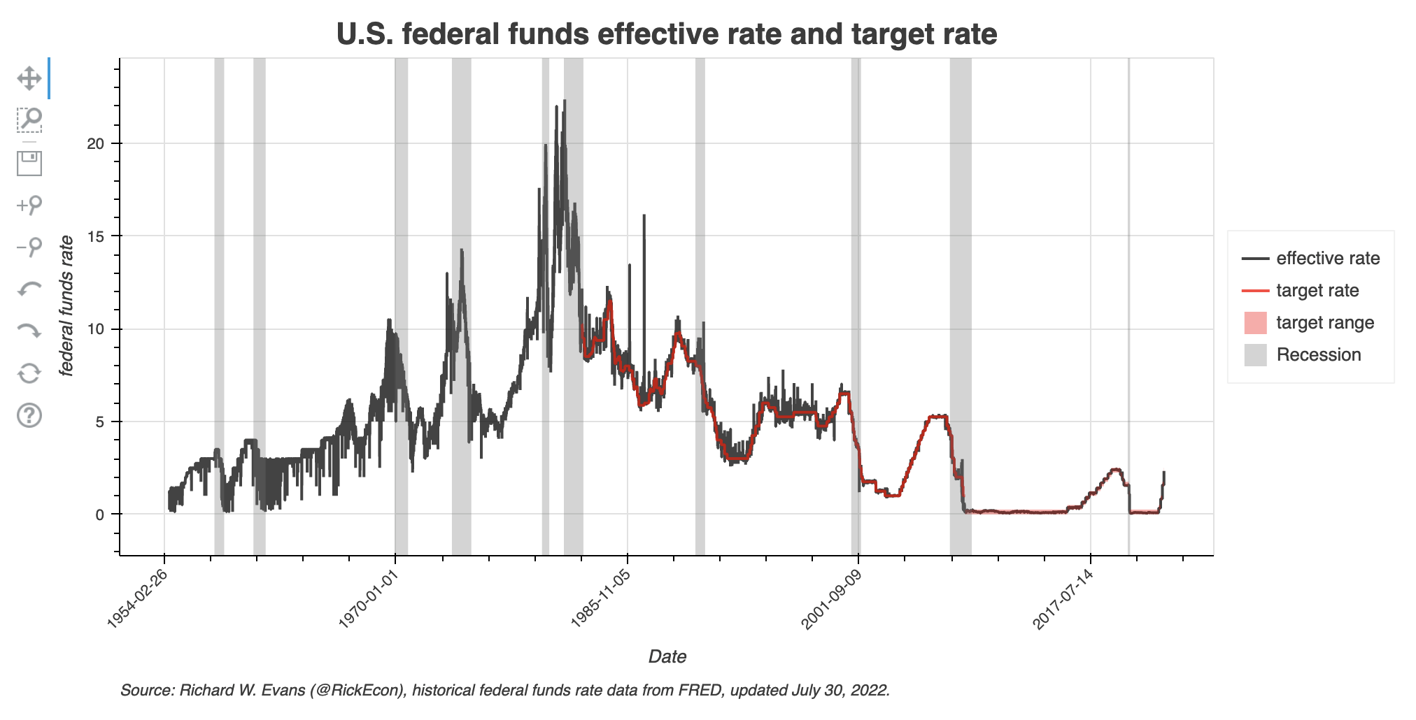
U.S. Federal Funds Effective Rate and Targets
Explore this visualization that shows the time series of the federal funds effective rate and its Federal Reserve target rate and target range.
View visualization →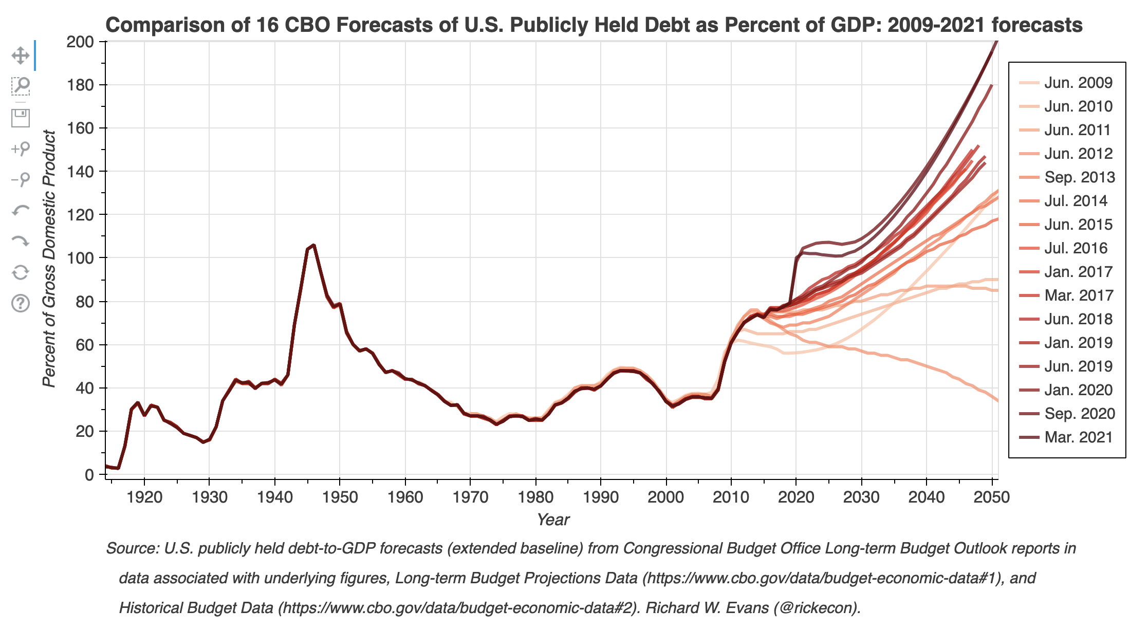
Comparison of CBO U.S. Debt-to-GDP Forecasts Plot
Explore this visualization that compares 16 CBO forecasts from 2009 to 2021 of U.S. publicly held debt as a percent of GDP.
View visualization →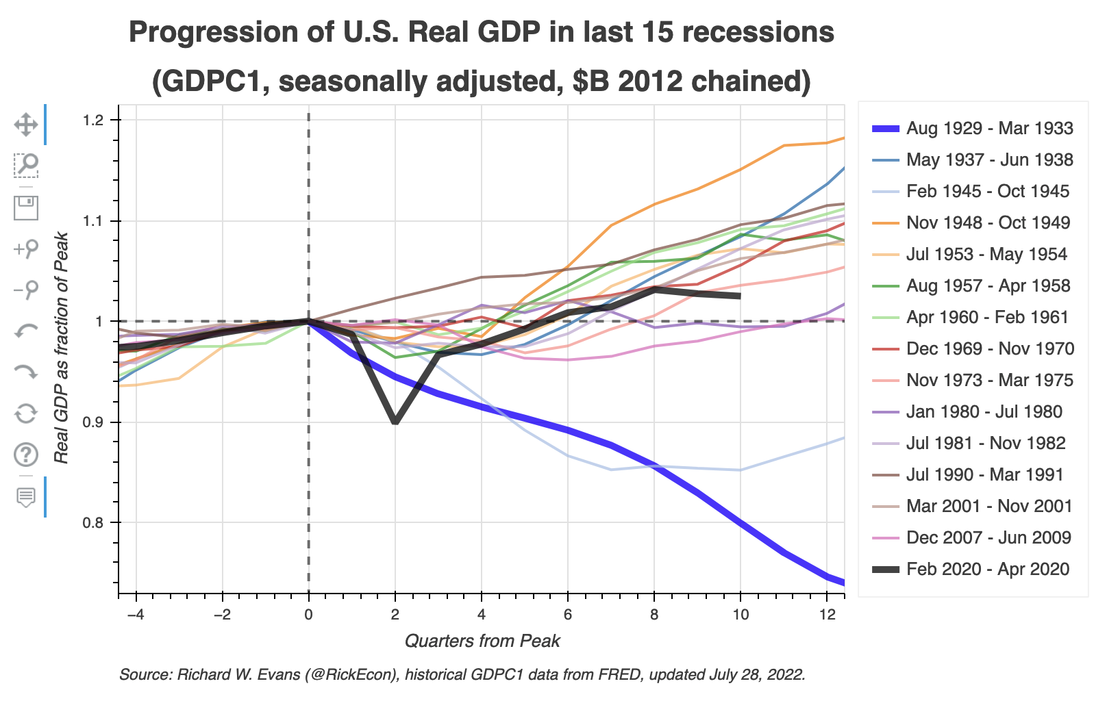
U.S. Real GDP Normalized Peak Plot
Explore the progress of U.S. real GDP (GDPC1, quarterly, seasonally adjusted, $billions 2012 chained) in the first quarters of the last 15 recessions (1929-2022).
View visualization →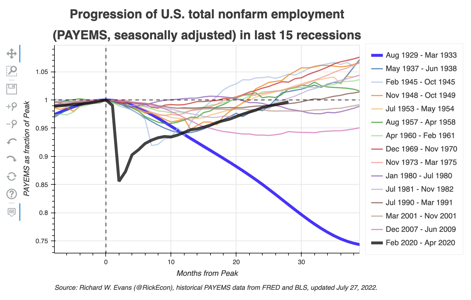
U.S. Total Nonfarm Employment Normalized Peak Plot
Explore the progress of U.S. total nonfarm employment (PAYEMS, monthly, seasonally adjusted) in the first months of the last 15 recessions (1929-2022).
View visualization →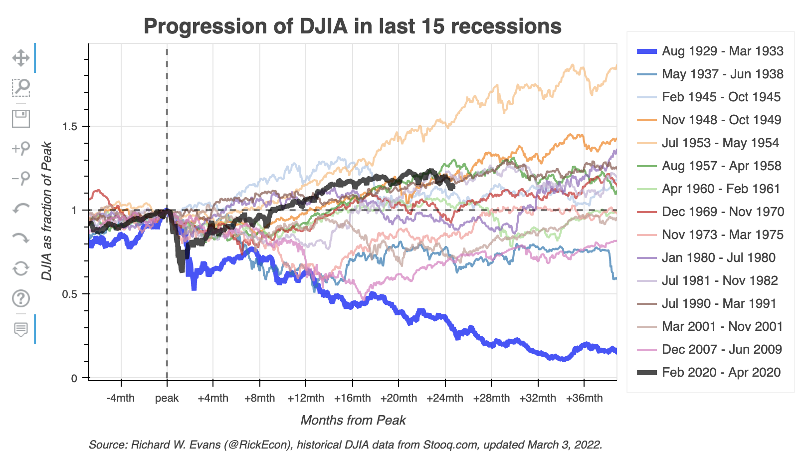
DJIA Normalized Peak Plot
Explore the performance of the Dow Jones Industrial Average in the initial months of the last 15 recessions (1929-2022).
View visualization →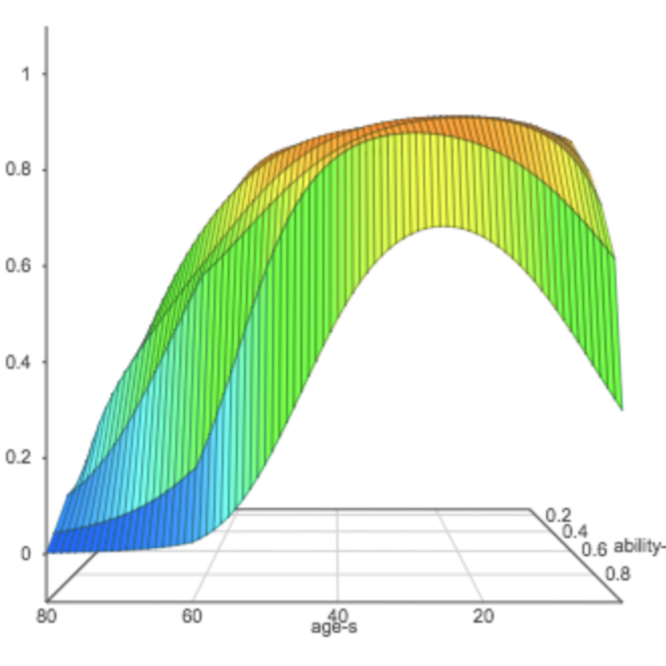
Overlapping Generations Model
Explore various aggregate and individual macroeconomic variables over time with both 3D and 2D plots.
View visualization →
Marginal Effective Tax Rates on Corporate Investments
Explore the effects of tax reforms on corporate investments in equipment and structure assets.
View visualization →
Tax Increase vs. Tax Decrease
Explore the changes units with tax cuts or tax increases by income over a span of 10 years.
View visualization →